
The Most Restful Bedroom Palettes
A good night’s rest is so important - not just because we all need our sleep, but also because of the connections to our physical and mental health. So everything about your bedroom’s design should help foster that good sleeping environment. Color is such an important part of that! I like to craft restful and soothing palettes that will send my clients into dreamland. Here are a few of my favorites that really work!
Beth Lindsey Interior Design
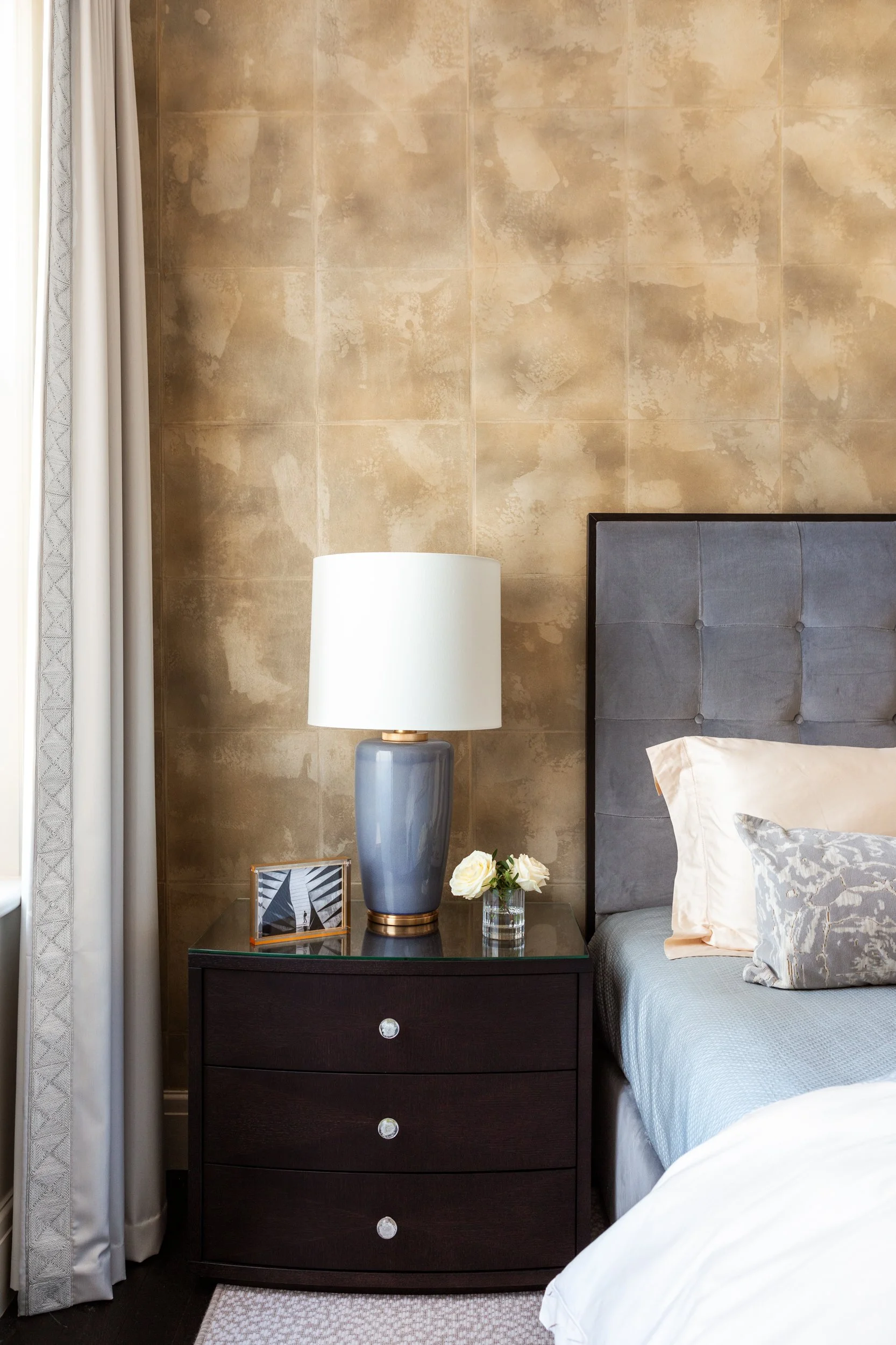
1. Taupe and Gray
Soft warm neutrals will always give you a quietly beautiful bedroom. Those colors are calming to the eye and they give you a cozy space in the evening when the light is dimmer. In my Kensington project above, that mix of neutral sand or taupe along with gray creates a welcoming retreat.

Beth Lindsey Interior Design
2. Green, white, and Gray
Green is such a great color for the bedroom - it actually reduces anxiety and creates a feeling of tranquility. Mixed with crisp white and a cool gray, it is a tailored and timeless look that also offers an oasis of calm.
Beth Lindsey Interior Design
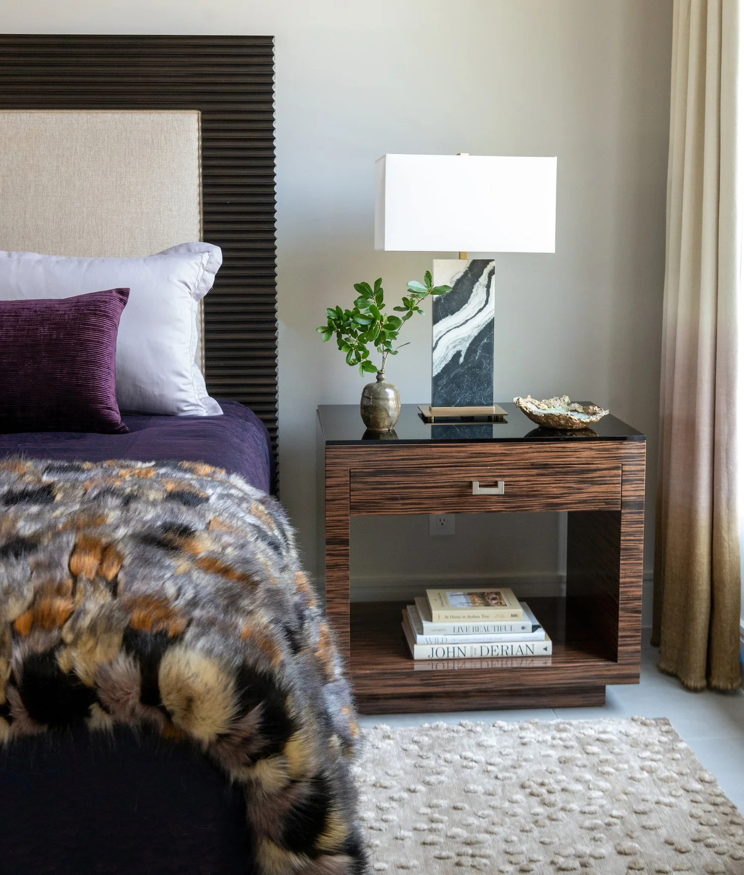
3. Plum and Brown
Deeper colors aren’t always a first choice for the bedroom, but this combination really creates a cozy feeling. It’s a comforting palette that pulls you in and envelops the room in a quiet style. The plum version of purple is deep and chic, giving a quiet punch to the color selections.
What palettes do you like for your bedroom? Let me know in the comments below!
Warmly,
Beth