
Color Trends for 2021
If you, like a lot of us, are already over 2020, then let’s look forward! Sherwin-Williams has just released its color forecast palettes for the home in 2021, and there are some amazing colorways. Grouped into 4 inspirations, these are the palettes that the paint company believes will dominate interior design in the coming months. Let’s take a spin through the color wheel!
Sherwin-Williams
Tapestry
This palette embraces both maximalism and classic looks, with bold and bright colors dominating the group. Influences include creative expression and sensory exploration. Paint colors include Cape Verde, Periwinkle, Tricorn Black, Jovial, and Jaipur Pink.

Beth Lindsey Interior Design
Sanctuary
Sanctuary is inspired by the interest in biophilia and bringing nature indoors. It’s also an outgrowth of the nesting instinct that we’ve all felt during the pandemic and shutdown. The colors are meant to connect the indoor rooms with the natural world. Paint colors include Messenger Bag, Oakmoss, Urbane Bronze, Canyon Clay, and Modern Gray.

Sherwin-Williams
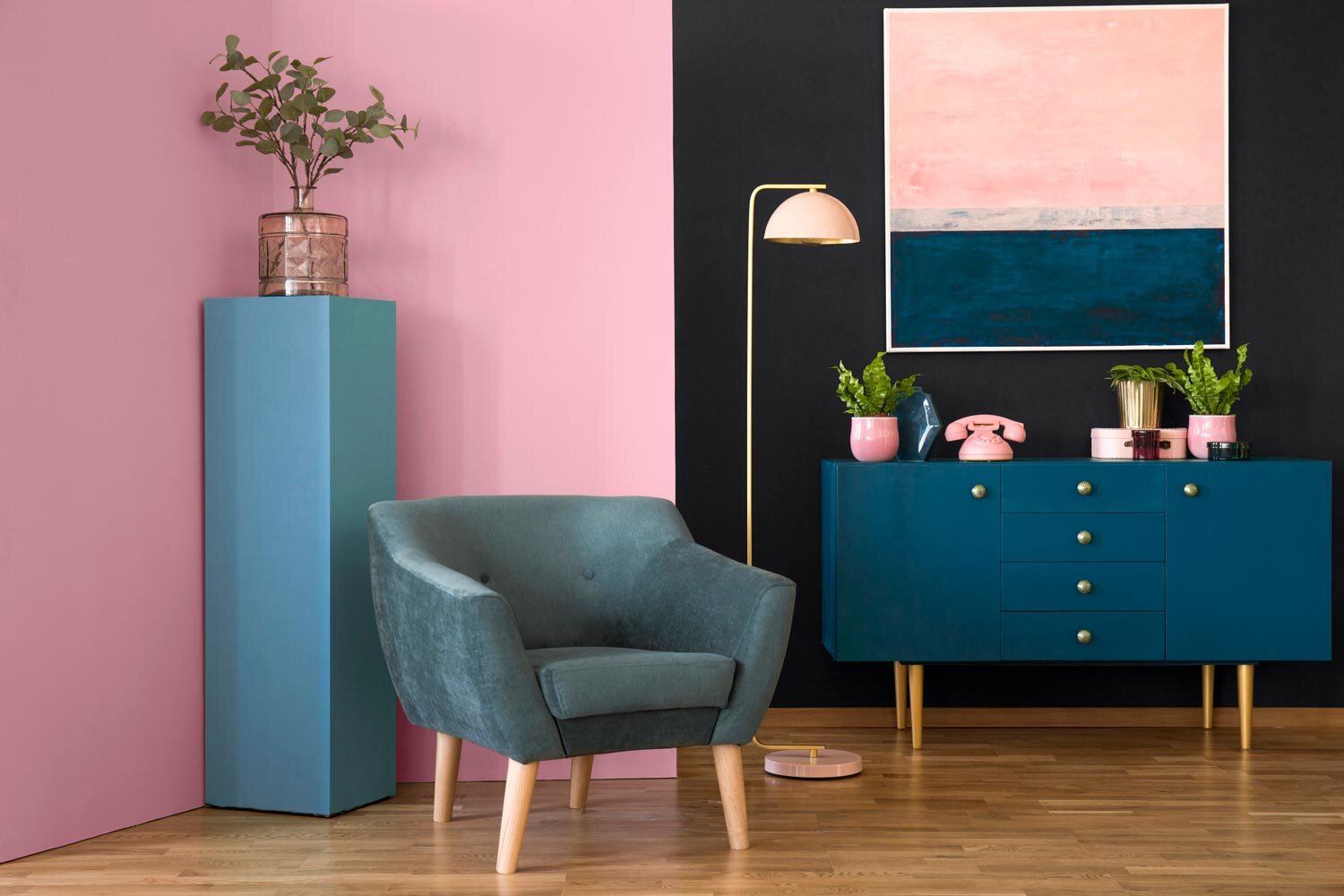
Encounter
The Encounter palette has an artisan vibe that includes a bit of Boho, too. The rooms - and the colors - are meant to evoke a story about craft and creativity, with a focus on local vendors and a sense of place. Paint colors include Java, Rosemary, Naval, Blustery Sky, and Tarnished Trumpet.

Sherwin-Williams
Continuum
Connecting the past and the future, Continuum is inspired by shape, sculpture, sea, and sky. The palette ties the engineered modern world to the mid-century modern past, creating a new look that is fresh and cutting-edge. Colors include Cyberspace, Moonraker, Novel Lilac, Crushed Ice, and Commodore.
Which of these palettes is your favorite? I’m gravitating toward Encounter and Sanctuary, but they all have beautiful colors.
Warmly,
Beth