
The Colors of the Year
It’s the most wonderful time of the year! No, not the holidays (although they’re pretty great, too). It is the time of year when forecasters and paint companies announce their color trends for 2023, including the Color of the Year. As you’re about to see, they never agree on the color and some of them can be a little out there, but it is fun to see the palettes they come up with. Here are the top 5 Colors of the Year and how you can use them in your home.

Beth Lindsey Interior Design
Pantone’s Viva Magenta
Pantone is the power player when it comes to making color predictions. The anticipation builds at the end of November as everyone waits to see what Pantone will announce. This color is bold and beautiful, but not necessarily made for painting your walls. Pantone makes these predictions for fashion and home, and I can tell you that I would love to wear this color. But you can still bring Viva Magenta into your rooms - just think about accessories like pillows and art. I love the bold look of the painting I used in a home gym above.
Beth Lindsey Interior Design
Behr’s Blank Canvas
On the other end of the color scale is this warm white from Behr. It’s a bit more pragmatic and is meant to sooth and calm the spirit. This is a color that can cover an entire house, not just a single room. And it’s a step away from the stark whites we’ve seen in homes recently.

Beth Lindsey Interior Design
Sherwin-Williams’ Redend Point
It seems that some version of blush or pink is going to be with us for a long time. First known as Millennial Pink, this newer version is a little more dimensional. I used a great blush in the girl’s room I designed above, and I could see using this fabulous color in many more rooms.

Beth Lindsey Interior Design
Krylon’s Spanish Moss
Another great color I would love to use in my projects is this great green from Krylon. It’s another soothing color that would make almost any room feel cozier. It was a warm addition to my Telluride project’s den, as you can see above.

Beth Lindsey Interior Design
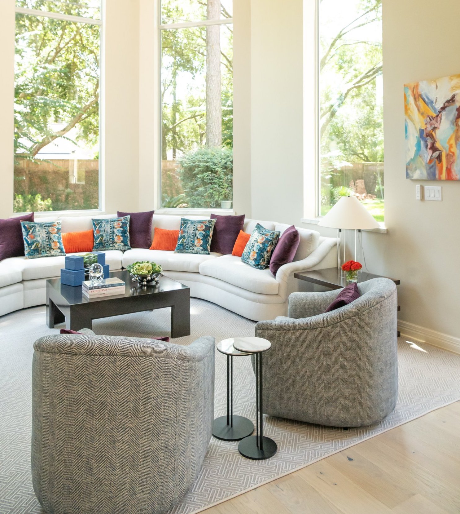
Benjamin Moore’s Raspberry Blush
I expected this color to be more pink, but it’s actually a red-orange. It’s another very bold color choice for a paint company, and it’s another version of the terracotta we saw so much of recently. The color is very similar to the pillows I used in my project above, and I would definitely use it for accessories.
So which of these colors do you love for 2023? Let me know in the comments section below!
Warmly,
Beth